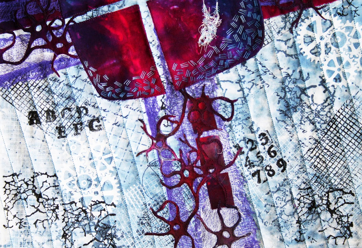
The quilt gave me the opportunity to play with some new materials and use a variety of methods to construct it. It also provided a challenge as "good ideas" went wrong and had to be overcome.
Sunday, February 9, 2014
Oops!
Balance has been a challenge just lately, which is probably why the image that came to mind was one showing what can go wrong when balance is not achieved.
The quilt gave me the opportunity to play with some new materials and use a variety of methods to construct it. It also provided a challenge as "good ideas" went wrong and had to be overcome.
Materials used: textile paints, inktense pencils, misty fuse, bondaweb,
hand dyed and commercial fabrics, and sequins from a very old bag of
odds and ends
The quilt gave me the opportunity to play with some new materials and use a variety of methods to construct it. It also provided a challenge as "good ideas" went wrong and had to be overcome.
Saturday, February 1, 2014
New month - new challenge
I have been pondering a lot on what to choose as our next theme. There were many suggestions on my pad, but I had to choose one. It is February, and soon Valentines day, and, this may seem rather trite, but our next theme is:
LOVE
Love can be so much more than a Valentin card or present:
- people we love, children, family, our loved ones...
- nature
- film or books
- history
- colour
- fabric and thread
- some beautiful lines and texture
-
-
-
The list can go on and on. Go in yourself, find what you love, and make something beautiful out of it.
Enjoy, Greta
LOVE
Love can be so much more than a Valentin card or present:
- people we love, children, family, our loved ones...
- nature
- film or books
- history
- colour
- fabric and thread
- some beautiful lines and texture
-
-
-
The list can go on and on. Go in yourself, find what you love, and make something beautiful out of it.
Enjoy, Greta
Friday, January 31, 2014
The Three Musicians Unbalanced
For this challenge I decided that I would have a bit of fun playing on the work of Picasso, no less!
The Three Musicians is a painting which delights me in a number of ways including it's wonderful balance of warm and cool colours. In this quilt I attempted to proportion warm and cool in the same manner.
The quilt was made in a very free-form style. I had a wonderful time putting it together all the while learning much about the painting that it is based on.
quilted by Heidi Wulfraat
The Three Musicians is a painting which delights me in a number of ways including it's wonderful balance of warm and cool colours. In this quilt I attempted to proportion warm and cool in the same manner.
The quilt was made in a very free-form style. I had a wonderful time putting it together all the while learning much about the painting that it is based on.
quilted by Heidi Wulfraat
FRAILTY
I didn't
have any idea right after announcing the next theme. As usual I‘ve checked “Wikipedia”
for starting point. But nothing have touched my mind and again I postponed this
quilt.
As most of
us noticed, time runs really fast and one week ago I sat down and started
looking for idea. Just one day before my husband came back from “eagle hunting”
and brought me a very soft feather. It was laying on the table and caught my
eye.
Any kind of balance is
so frail and sometimes even such a soft and almost weightless feather can break
it.
Is it Enough?
January 2014 Challenge Theme: "Balance"
When I first thought of the challenge theme, my initial
images centered around trying to balance my everyday pressures of work, play and
rest. But, when we think about our art
work, the principles of design play such a central role in the success of our
piece, that balance came to mind. I
think the hardest thing when creating art is to know when to stop working on
the piece and call it finished. So, my
quilt is called "Is it Enough?"
The fabric is demin.
I've used perle cotton thread for the embroidery stitches, each one
being a different stitch and a variety of beads and sequins.
![]() |
| "Is it Enough?" |
| "Is it Enough?"_Detail |
Equilibre
As soon as I read the title of our new theme many ideas came to my mind. As an ENT surgeon I often had patients with balnce disorders. On the other side, I also had to make sure that some persons I saw didn't have balance disorders. Last october I started taking yoga classes where some positions require a good balance. Yoga is also a mean to achieve a better inner balance.
I finally decided to use the tree position from yoga.
The right shape is cotton fabric fused to the background and stitched with satin stitch. The left shape is made of sheer polyester fabric and stitched also with a satin stitch and acts as a shadow to the first shape.
The quilting lines are horizontal as in perfect balancce.
I choose a light blue green background and almost tone in tone fabrics for the shapes to achieve a quiet, peaceful effect. The background is hand-quilted as I found the continious machine quilted lines to be too strong.
commercial hand-dyed cotton fabric
cotton and polyester thread
polyester batting
Sabine
I finally decided to use the tree position from yoga.
The right shape is cotton fabric fused to the background and stitched with satin stitch. The left shape is made of sheer polyester fabric and stitched also with a satin stitch and acts as a shadow to the first shape.
The quilting lines are horizontal as in perfect balancce.
I choose a light blue green background and almost tone in tone fabrics for the shapes to achieve a quiet, peaceful effect. The background is hand-quilted as I found the continious machine quilted lines to be too strong.
commercial hand-dyed cotton fabric
cotton and polyester thread
polyester batting
Sabine
Sur le cou-de-pied
I started by analyzing Balance, and several ideas sprang to life, but one settled. When I was younger, classical ballet was a great part of my life. And the most important part of ballet is balance. In every movement you have to find the balance of your body.
Next, I had to find how to express this, my first thought was to use an image of my old battered shoes hanging on the wall. But they did not express much balance. But this position, "Sur le cou-de-pied", pins the body to the ground when it is in balance.
I decided to go for stenciling this time, and made two stencils out of freezer-paper, one of the feet and one of the shoes. I used acrylic paint with textile medium. Then I added shadow with Paint-sticks, quilted the shoes and filled the background with ballet-terms. I finished it all with some hand-stitching to suggest the floor.
Next, I had to find how to express this, my first thought was to use an image of my old battered shoes hanging on the wall. But they did not express much balance. But this position, "Sur le cou-de-pied", pins the body to the ground when it is in balance.
I decided to go for stenciling this time, and made two stencils out of freezer-paper, one of the feet and one of the shoes. I used acrylic paint with textile medium. Then I added shadow with Paint-sticks, quilted the shoes and filled the background with ballet-terms. I finished it all with some hand-stitching to suggest the floor.
And some close ups:
Balancing Act
I have always been interested in the functions of the left and right sides of the brain. The left side deals with logic, analysis, sequencing and time. It is the area for speech, mathematics, science and language. It deals with the details of every aspect of life and prefers structure and orderliness.
The right side of the brain deals with emotion and the big picture. It is the area for creativity, intuition, colour, shape and pattern. It has no sense of time or true language but rather uses a visual form of communication. Its connections are more random and spontaneous rather than sequencial. It is not bound by rules or regulations but is more free-wheeling in its processes.
While working on this quilt I tried to use both halves of my brain. The left side was the leader in planning the content of the quilt. It did the research, collected images and information, looked at colour palettes and set up a time line. The right brain was then asked to present a whole, complete image based on this information. Then it was back to the left brain to develop a work sequence, techniques and approaches. The right brain stepped in whenever there was an overall design decision to be made.
Being a very left brain dominant person, it was an interesting experience trying to work in this intuitive way.
In the quilt, the left brain is represented by the background while the right brain is represented by the areas of strong colour. The concept was to have both areas work together to create a sense of balance.
Hand printed and dyed fabric, surface design, appliqué, machine quilted, hand stitched
'Bird Brained Balance'
I had this image in my mind the minute the theme was
announced! I set some parameters for myself that the piece would be whimsical,
using bright pinks and oranges and fresh (i.e. not overworked).
I spent some time playing with bird forms in my sketchbook
and came up with the shape of the birds- I’m sure I have been influenced by
children’s’ picture books, having worked as a teacher librarian for many years.
John Birmingham comes to mind.
I found a graduated pink and orange graduated fabric in my
stash and fused on the birds with shimmery cotton that looked like silk in cool
colours. I used some pastel Kaffe Fassett design for the see-saw. Then it was a
matter of fusing and thread-sketching the pieces into place. It was finished
off with a swirly free-motion quilting pattern.
It would be great to make a little series of these with the
brainless birds doing other things with play equipment. I think they would be a
nice addition a child’s room or nursery.
![]() |
| Bird Brained Balance |
![]() |
| Detail 1 |
![]() |
| Detail 2 |
Balance?
When this theme "Balance" was announced I thought there were so many possibilities that it should not be too difficult to find a good idea to interpret the theme, but with many options to tackle, it was not so easy any longer. What to choose? The balance practice at the gym was my first thing to ponder about, building towers with lego and blocks were another one, but at the end I chosen to build something with stones. I like stones and organic forms so make something with stones were a good choice, a bit of a challenge though, to make a balanced pile of stones, perhaps impossible?
As I wanted to give the stones different textures I used a lot of different materials, which are raw appliquéd on top of a background fabric dyed with Procion MX Dye.
Materials used are: cotton fabrics, Evolon, wool, paper, Lutradur, textile paint, foil and silk, metallic and wool threads.
A balanced diet - celery and chocolate
The theme of balance has so many options. My first inspiration was to reproduce a 1930s poster of a beauty poised on a diving board. But even though I found many posters that I liked, I decided that applique was something I have used successfully many times before, so I went with a second choice. I wanted to try something more improvisational and abstract. I often admire Melody Johnson's work and how she combines saturated colours with mixed piecing and applique, and machine and hand stitching.
I tried not to plan, sketch or be too literal. It was much harder than I imagined, but my trusty portable design wall helped me to add, take away, alter proportions etc. I felt happy when I got to the stage where the piece looked balanced whichever way up it was.
One of my aims was to use hand stitching and/or beading. I have a drawer full of threads and another of beads. I only managed to use a token amount of both. Even though I know of artists using them successfully all the time, for me they suddenly tip a work over into 'tea cosy' craftiness and away from the design elements I am more interested in.
If you look closely you can see the words Cadbury's and Celery stitched into the quilting. Both foods
are high in antioxidants and therefore nutritionally sound!
I tried not to plan, sketch or be too literal. It was much harder than I imagined, but my trusty portable design wall helped me to add, take away, alter proportions etc. I felt happy when I got to the stage where the piece looked balanced whichever way up it was.
One of my aims was to use hand stitching and/or beading. I have a drawer full of threads and another of beads. I only managed to use a token amount of both. Even though I know of artists using them successfully all the time, for me they suddenly tip a work over into 'tea cosy' craftiness and away from the design elements I am more interested in.
If you look closely you can see the words Cadbury's and Celery stitched into the quilting. Both foods
are high in antioxidants and therefore nutritionally sound!
Sunday, December 1, 2013
November. Escape from grayness.
I could not
cook up where or from whom to escape for a long time. I broke down my mind… So
finally I decided to forget about this theme for a while.
But time runs so
quickly and suddenly I realized that there is only one week remains till reveal
day. I haven’t started to sew yet… I even don’t have any idea… I can not
postpone this any more!
So, I was
sitting in my sewing room with a cup of coffee, the weather behind the window
was hateful: rain, cold, everything is totally grey and black… I hate such
weather! Such days in our sunny city usually happen in November so I don’t like
this month.
And in my
sewing room was warm, a lot of bright patches around and a cup of coffee. WOW!
This is an idea!
“November. Escape from grayness.”
I have an
idea and it’s time to sew! And it takes two days to make!
January 2014 Theme..... "Balance"
When I read everyone's weekly updates especially when deadlines are looming, there are some common themes that come out. Usually they reference that time is running out and that projects are still unfinished. So, this challenge theme will be "Balance", something we all strive for, but is hard to do.
Enjoy, Katie
When I read everyone's weekly updates especially when deadlines are looming, there are some common themes that come out. Usually they reference that time is running out and that projects are still unfinished. So, this challenge theme will be "Balance", something we all strive for, but is hard to do.
Saturday, November 30, 2013
If Not Here, Then Where?
The theme of
escape can bring many different things to mind, some pleasurable, some fanciful
and some more dire. I think that it would be a rare individual who never wished
for an escape from one thing or another.
In my quilt
I wanted to ask the question “ Escape to where?” Simply put, if I were having a
perfect day, where would I be? What would I be doing? Who would I be with?
The answers
to these questions would probably vary depending on the situation
that I wanted to escape. If it were the cold of winter, I might want to be on a
tropical island. If it were from the tedium of everyday life, I might want some
place exciting or stimulating. If it were from the noise and chaos of a big
city, I might want to be in a tranquil and serene place. The possibilities,
like the reasons, are infinite and personal.
In this
quilt I have created a map of an imaginary place to represent all of the
imaginary places that I might wish to be. My presence is represented by an
abstract copper coloured symbol which symbolizes a compass for direction but
with a central square which represents me. I am, therefore, the heart of this
desire and the chooser of the destination.
Tempus Effugere
The quilt was an escape from the tumult of daily life as the various processes and hand quilting required focussed attention. It was also an exploration of several new processes, and a way of working with art cloth to transform it into a quilt.
Techniques:
Tray Dye with Procion dyes; screen print using textile inks and thickened Procion dyes; discharge with Jaquard Discharge Paste; Stamping; screen print through freezer paper stencil; gold leaf; hand and machine quilting
Sunset at Jimbaran Beach, Bali
So many differnt interpretations came to my mind when I learned about our new theme. Quilting in itself is an escape for me, as it is probably for the other members of this group. But also reading, listening to music, dreaming can be ways to escape the demands of everyday life. And of course traveling.
My husband and I enjoyed traveling before we had children. My favorite place of all we have been to is the indonesian island of Bali, and not only because of the wonderful batik fabrics produced there. The people are so friendly, you really get the feeling it still comes from the heart and not because as a tourist they hope you will buy something or leave a good tip. As we were staying in a hotel in Jimbaran we often went to some fishermen's restaurant directly on the beach in Jimbaran. There we would sit at the table, barefoots in the sand and enjoy a wonderful meal while watching the sun sut in front of us.
I hope to return to this wonderful island one day when our children are older. For the present time I can only escape there in toughts. The memories of our vacation are still very present.
The background is made of commercial hand dyed fabrics by Heide Stoll-Weber. The black horizont line, the clouds, the sun and its reflection in the water are wool felt and machine felted to the background. The sun reflection is quilted with metallic thread to add more glitter.
Materials:
cotton fabric
wool felt
polyester batting
metallic and polyester threads.
Sabine
My husband and I enjoyed traveling before we had children. My favorite place of all we have been to is the indonesian island of Bali, and not only because of the wonderful batik fabrics produced there. The people are so friendly, you really get the feeling it still comes from the heart and not because as a tourist they hope you will buy something or leave a good tip. As we were staying in a hotel in Jimbaran we often went to some fishermen's restaurant directly on the beach in Jimbaran. There we would sit at the table, barefoots in the sand and enjoy a wonderful meal while watching the sun sut in front of us.
I hope to return to this wonderful island one day when our children are older. For the present time I can only escape there in toughts. The memories of our vacation are still very present.
The background is made of commercial hand dyed fabrics by Heide Stoll-Weber. The black horizont line, the clouds, the sun and its reflection in the water are wool felt and machine felted to the background. The sun reflection is quilted with metallic thread to add more glitter.
Materials:
cotton fabric
wool felt
polyester batting
metallic and polyester threads.
Sabine
'Escape Plan' by Linden Lancaster
After reading about collage process used by Valerie S. Goodwin, I decided to make an ‘Art quilt map’ to fit in with this theme of ‘Escape’. The building plan I have used is fictional and has no particular significance. It is up to the viewer to decide if it is a prison, castle or a house.
My
primary intention of this piece was not so much in interpreting the theme, but
to present a visual buffet of shape, line, texture and colour.
The
collage process was quite an enjoyable one:
1. Light coloured fabric were cut (or
torn) and sewn onto a substrate.
2. Chunky hand sewing was then added
in a random way to give this background some extra texture.
3. Fabric paint was added
sparingly with a brush to unify patchwork pieces together. I also added a stencils throughout the process.
4. A few sheer fabrics were then
applied with misty fuse.
5. The linear and rectangular
elements of the plan were then fused into place and thread painted/quilted.
6. More hand sewing was then
added to give the piece more interest.
I think I would like to make another piece of a place
that I identify with– something with paddocks, rivers and dirt roads. I also
like the idea of adding your own poetry, like a Haiku.
![]() |
| 'Escape Plan' by Linden Lancaster 2013 |
![]() |
| 'Escape Plan' detail 1 |
![]() |
| 'Escape Plan' detail 2 |
Escape
At first glance, this was an interesting theme. But when I started working with it, I had problems how to solve it as a quilt. I decided to go abstract, focusing on this:
Escape = an act of breaking free from confinement or control.
We live in a world where, in certain environments, being "out of the box" is not always a good thing. You have to fit in. So, I've tried to show this by breaking it all down to squares - in rows - with military precision, except for the one escaping and blooming. Because these people are sometimes regarded like a weed, like a dandelion. They are strong, beautiful, full of colour, they have freed themselves from the rules of the garden and pop up wherever they want!
Escape = an act of breaking free from confinement or control.
We live in a world where, in certain environments, being "out of the box" is not always a good thing. You have to fit in. So, I've tried to show this by breaking it all down to squares - in rows - with military precision, except for the one escaping and blooming. Because these people are sometimes regarded like a weed, like a dandelion. They are strong, beautiful, full of colour, they have freed themselves from the rules of the garden and pop up wherever they want!
Labels:
applique,
colourful,
Escape,
french knots,
Greta Huseboe,
grey,
quilt
Dichotomy
I had about 25 things on my suggestions list for the theme of Escape. I chose to go with the theme of cages. Aside from the literal idea of keeping wild birds in cages or setting them free, it seemed like we are all in cages. Sometimes we make our own bars, by creating a home, an environment, where we are cocooned from the wildness of nature. Sometimes other people put cages around us to protect us, and sometimes we are truly imprisoned by others' desires for power and control.
When we have the chance to escape to freedom, not everyone chooses that path.
Birds are naturally free in the elements, but they then have the 'prison' of finding food, shelter and avoiding predators.
Life is never entirely black or white, and that's why I chose Dichotomy as my title.
This quilt can be hung either in the black or white orientation.
The technicalities were that I drew the basic outlines of the cages and birds on soluble stabiliser and stitched it from the white side. I then washed the quilt to remove the soluble before more stitching and applique. The advantage of the outline stitching was that I had the exact placement for both sides of the quilt. The main stitching was done with 30 weight thread, while the quilting was done with very fine thread. Even though there are little 'ticks' of fine black thread on the white side where I changed direction, I find they add a certain pattern to the stitch.
When we have the chance to escape to freedom, not everyone chooses that path.
Birds are naturally free in the elements, but they then have the 'prison' of finding food, shelter and avoiding predators.
Life is never entirely black or white, and that's why I chose Dichotomy as my title.
This quilt can be hung either in the black or white orientation.
The technicalities were that I drew the basic outlines of the cages and birds on soluble stabiliser and stitched it from the white side. I then washed the quilt to remove the soluble before more stitching and applique. The advantage of the outline stitching was that I had the exact placement for both sides of the quilt. The main stitching was done with 30 weight thread, while the quilting was done with very fine thread. Even though there are little 'ticks' of fine black thread on the white side where I changed direction, I find they add a certain pattern to the stitch.
Escape
When this
theme was announced there was only one thing that appeared in my mind. It was
our plot with olive trees and the view from our house in Greece. This really is the place to
which I can escape and use my time to all the things that make me happy and
creative and with very little "musts".
I chose to
make a piece showing the wonderful view
I can enjoy and look at every day when I am there with the olive trees in the
foreground and the Messenia Gulf and the
peninsula, on the other side of the Gulf with the high mountain top, the Prophet Elias, 2400 meters over above sea level.
The background is whole cloth, painted with Dye-na-Flow paint and four patches are sun printed with Dye-na -flow paint, screen printing ink and fabric paint with letter masks made from freezer paper with the letters esc , as the word esc on the PC keyboard.
On top of
this I have printed some olive trees on ExtravOrganza and fused them using white Misty
fuse.The background is whole cloth, painted with Dye-na-Flow paint and four patches are sun printed with Dye-na -flow paint, screen printing ink and fabric paint with letter masks made from freezer paper with the letters esc , as the word esc on the PC keyboard.
Finally the piece is quilted with running stitches and seed stitches with cotton and metallic threads. In order to emphasize the trees I put some paint with Shiva paint sticks on top of the embroidery stitches on top of the trees.
Subscribe to:
Posts (Atom)