Monday, March 31, 2014

Song of Solomon by Linden Lancaster


'Song of Solomon' (or 'Song of Songs') is a book of the Old Testament. It tells of the intimate story between a young King Solomon and a Jewish maiden, their feelings for each other and their longing to be together. 
I started off with a lovely soft screen printed background. Various elements referencing love were then added. I printed the text from an antique bible (that was falling apart) onto fabric, which was fused on. The music is from the song ‘When you were Sweet Sixteen’, one of my favourite love songs made famous by the Irish band 'The Furies'. Lace and buttons, represent a wedding gown.  I have used warm colours to depict passion. Roses, the flower of love, have been thread sketched/quilted in a contrasting black thread over the top to add some definition and  unification. Darker reds, yellows and pinks were then splashed into the flowers with inks and crayons.


Song of Solomon


Detail 1


Detail 2

Crocus - Love for the Garden in Spring


Gabriele Bach: Krokus - Liebe zum Fruehlingsgarten

Love is a very difficult theme and I spent a lot of time thinking about it. But when I saw my little garden in the sunshine, it was clear for me, what I wanted to show in my quilt. I love my garden, especially in the early spring when it is full of crocuses and snowdrops. The crocus is a wild sort and they become every year more.
For my quilt I had the idea to show the flower with a wide border. I admire often the hand embroidery in other quilts and this time I wanted to use seed stitch to present the wealth of crocus blossoms in my garden. I have self- dyed embroidery yarn, which waits to be used.
Every year again I admire the crocuses in my garden and I am very happy that I made at least a quilt with the crocuses.


I used mostly self-dyed cotton and embroidery yarn, pieced and quilted with the machine and made the embroidery by hand.

Love’s Illusions


Most of us grew up with a fairy tale, Hollywood movie image of love. One day our Prince Charming would sweep us off our feet and whisk us away to a wonderful castle where we would live, rich and happy forever. There would never be any problems or discord, just longing gazes into each other’s eyes and eternal bliss.

For most of us who have been in relationships in the real world, we know that Life sends us many challenges whether health or finances or family or personal issues that test our love.

These challenges can affect a relationship and make it stronger or eventually wear it down. For those who survive the tests the result is a true love based on having seen each other at our best and our worse and having decided that we love and respect and accept each other no matter what. This is True Love!

In this quilt I have woven a double ikat in shades of red to represent love in its many forms and in shades of blue-green to represent the various challenges. The resulting fabric is the fabric of Life.

The white fabric is covered in black text that represents the good and bad aspects of a relationship. The red text consists of the fairy tale words. When we look at love through rose-coloured glasses we selectively choose the fairy tale words and ignore the rest.


Stone Love


The theme for March was LOVE and as this word can be interpreted in so many ways I come to think
of my love for stones and the way they have always fascinated me with their shapes, textures and colors. Not far from where I live there is a church ruin from the 12:th century, which slowly is falling to pieces but with still some lovely stonewalls remaining. Those stonewalls have inspired me to make this  stone piece.


For the stones I used fabrics that I had rust dyed and also some fabrics crackled with flour paste and painted with black acrylic paint.
The stones are raw edged appliquéd. Threads used are cotton and the batting is 80/20 cotton polyester.


Love - ursa major and ursa minor

I am not a sentimental person, and I have almost no family, so it was quite hard to think of special moments that involve love. So instead I thought of the way that animals show affection, and the strong bond between mothers and their offspring.

I found a photo of polar bears that illustrated my point quite well.  Several friends have been to the Arctic in recent years to see polar bears - one saw lots, and another only one in the distance. I am a supporter of Greenpeace, and was involved in mailing people about the Greenpeace activists who were imprisoned in Russia as they were protesting against drilling there.

All of these combined to make this a subject that I feel strongly about, preserving areas of natural ecosystems that are at risk of being permanently destroyed. We know that polar bears are finding the shorter hunting season a problem, and many starve as a result.

As I constructed my piece, using all hand dyed or painted fabrics, it reminded me of the marble floor in the church Santa Maria degli Angeli in Rome. This has a meridian line across the floor and up one wall, which the sun strikes and shows which astrological sign is current in the calendar. That thought led me to investigate the constellations of ursa major and ursa minor, a nice play on the mother and baby bears. I have never been able to 'see' the creatures and people in the stars. These are relatively close to the shapes in some star guides.


One collection of zodiac signs from Santa Maria degli Angeli.


Love Tulip

When I put out this challenge, I called it maybe trite but when I started working on it, it really ended up as a challenge for me. While I was looking in my sketchbooks, and my heart for ideas, I came across a journal-quilt I made last year. It was worked with spraying through stencils with some tulips. And I really love tulips with their many shapes patterns and colours. And not to forget it's history. The first tulip in Norway, bloomed in the garden of an old pharmacy here in the center of Bergen more than 400 years ago.
So I had an idea, but how to interpret it. By spraying and stenciling I managed to get a piece of cloth I liked, but I also needed a focus. I went to one of my other great love: Letters, in all it's sizes and fonts. And how they can be decorative as well as have a meaning. So I stenciled a big L on top of it all and put the rest of the letters for love as a decoration on it. I hand quilted the visible tulips, machine-quilted the background and appliqued a photo-transfer of a tulip from my garden as a finishing touch.


And some close-ups:


O Canada

Love….. it can go from one extreme to another; either it is totally mushy and commercial or something as simple as a love of the outdoors.  

Well, I wanted to do something completely different. Firstly, I haven’t done any hand stitching in this piece except when putting on the binding; and secondly, I’m getting over my fear of free motion quilting and have done the entire background in different motifs.

During the Olympics in February, I found that every time the Canadian flag was raised, I stood proudly in my living room belting out the Canadian anthem with a great sense of pride.  So, my interpretation of “Love” is for my country.  I may not like the politics, the politicians, the taxes or the weather, but I’m very thankful to be living in this country - O Canada!
  
O Canada - Detail 1

O Canada - Detail 2
Material:         Commercial cotton and batik fabric
Technique:      Free motion quilting, fused maple leafs, trapunto

Katie

Sunday, March 30, 2014

Next challenge theme: SPACE

Space...a word that can mean so many different things and cover a vast array of concepts and ideas...
Here's just a few I thought of:

Inner space
Outer space
Personal space
Spiritual space
Positive space
Negative space
Parking spaces
The space between objects
The space/s we share with our friends & family
The space/s we create for ourselves...

I hope you are happy with this next theme and can get those creatives juiced flowing!

All the best,
Amanda

Saturday, March 29, 2014

Leftovers


When I did my research for Balance, I made several attempts in my sketchbook, using paper-stencils. As I didn’t want to throw these in the bin,  I played a little on some of my less successful  attempts, and suddenly, I got new ideas to explore later, maybe…

This is just the cut-outs of the ballet-shoes, glued on some prints, with the left-over from my paint roller:


I had also made an attempt with the ballet-shoes on a green background. A total miss, so I just glued some of the off-cuts on top and drew lines from the different layers. Interesting result:


And – as a reminder of our next reveal on Monday, here is a little peek from my sketchbook:


So, do pay us a visit on Monday, March 31.

Greta

Thursday, March 20, 2014

Something relevant to our next challenge

Dorothy Collard Challenge, 2013

Annie: – I decided to enter the Dorothy Collard Challenge, run by the Auckland Quilt Guild. The theme of this challenge was Word Art and I decided to use Alphabet signing to spell out the word Love. I seem to constantly be drawn to working with black and white; whether that is because I am not confident with colour or because I am naturally drawn to strong graphical images, I am not sure. I machine stitched the quotation from Voltaire – “Love is a canvas furnished by nature and embroidered by imagination”.
http://twosewingsisters.wordpress.com/
Love

Monday, March 10, 2014


How to make a Flour-paste crackle effect.

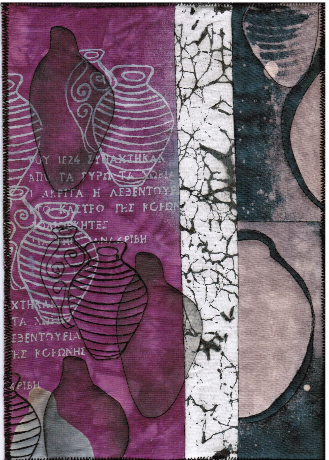
Last year I took an online course with Ineke Berlyn about making Journal Quilts, one piece for every month but with the same theme to explore, the same size and with a new technique every month. My choice of theme was "Urns" and one technique I learnt one month, was to make pattern with crackled flour paste and acrylic paint.


Above is my March JQ with a piece of flour crackled fabric. Size A4

Recipe: 
Prepare a 12" or 20 cm square of light or white cotton to make a piece of fabric with a crackle effect.
Gradually mix 100 grams of strong or ordinary white bread flour with about 150 ml of water with a whisk to make a smooth, medium thick pancake of batter.
Place the white fabric onto a some old newspaper and spread the batter in a thin layer over the fabric, using an old credit card or a squeegee. You can use any kind of flour. Whole wheat flour will give a coarser layer of batter and coarser crackle.
Leave to dry flat.
When totally dry you can crackle the flour crust.
Place it on a drop-cloth of plastic, flour- side up.
Mix a dark acrylic paint or fabric paint with a tiny bit of water.
Thoroughly rub it onto the fabric and into the crackles, use different colors if you like.
Leave it to dry again, overnight. Rinse out the flour and wash.

(This can also be done with a piece of dry soda-soaked cotton fabric and procion dye paste, left to cure and wash out. I have never tested this, but I think it would be wort a trial).

You will end up with an interesting textured piece of fabric.


Above are some of my flour crackled fabrics.
Good Luck with your crackling!

Ann-Mari

(Also this year I am making JQ ́s on-line with Ineke Berlyn. The theme is chosen by her and it is landscapes. It is really very challenging and much inspiering). 

Wednesday, March 5, 2014

Japan - An Artist's Dream

As many of you already know, I was in Japan in October of last year for 3 weeks and I thought this would be a good opportunity to post a couple of the highlights and details of some of the amazing art/sewing/haberdashery stores I found in Tokyo. What an artist's dream! There are so many visual treats all over Japan, from the modern to the extremely traditional, all an inspiration to me. My husband, Alan, was so very patient with me as I stopped, yet again, to take another burst of photos. I will give you the tip, don't ever have your camera too far away from you at any time while visiting Japan! (By the way, it's not as expensive as you think...it was 20 years ago, but highly affordable now).

The real highlight for me (apart from shopping in Tokyo) was visiting the Itchiku Kubota Kimono Museum on my birthday. He is the creator of some of the most amazing works of art I have ever seen; hand dyeing, stitching and embellishing his kimonos with passion and incredible creativity. Even my hubby was in awe of his work and we spent several hours in the museum.


Sadly, he passed away in 2003 at the age of 85 but his museum is a lasting reminder of his amazing work. The gardens around the museum are, in themselves, well worth the visit. Photography isn't allowed inside, only of the gardens, but if you are interested to see his work, here is one of many links you can visit: http://www.thekubotacollection.com/en
   
You may think it strange that I did all my shopping in Tokyo, but my hubby always insists on me doing my shopping at the end of a trip so we don't have to lug lots of stuff around. To me, and probably to all of you quilters reading this, this seems quite a ridiculous notion and highly improbable! I did in fact pick up some beautiful pieces of material and other lovely bits and pieces along the way from Osaka, Kyoto, Hiroshima & Mt. Fuji, stuffing them quickly in my handbag before hubby could see! In Tokyo, I found 3 great stores: Okadaya, Sekaido and Tokyu Hands.

Okadaya is the best store for all types of haberdashery and fabric.They have 6 or 7 floors of thread, needles, pins, buttons, ribbon,...I could go on and on. It really is a one-stop shop for us quilters. They also have an annexe filled with another 6 or 7 floors of fabric. I visited the one in Shinjuku which I think is the largest store. I was lucky as they had a 20 - 50% sale on and I could join up for their discount card on the spot.

Tokyu Hands describes itself as a 'creative life store' and it literally sells everything you could possibly imagine for any and all types of creative endeavor. Even hubby liked it and he stayed in the store much longer than his normal 10 minutes! 

The last store was Sekaido, another 6 glorious floors of art supplies, stationery and Japanese paper products. Heaven!


Here are a couple of links to a wonderful, website called 'blackcabbit' run by artist Dionnie Takahashi which revolves around everything Japanese. The first link is for craft stores in Tokyo (map included) and the second is about the Nippori fabric market in Tokyo which I unfortunately didn't get to see...oh well, there is always next time!


Enjoy your day & sayonara for now,

Amanda
 

Sunday, March 2, 2014

If only I had seen this sooner!

I have just returned from a trip to Burma with my sister and brother-in-law who are visiting me in Thailand for three months to escape Canada's very cold winter.

While there we visited this very famous pagoda and I thought it might have been an interesting image for our balance challenge last month.

Janice


Friday, February 28, 2014

Olympic quilt project

Sochi Olympic Games are over and I would like to tell about quilt project of Russian quilters.

These games were the first where quilt was one of the symbols and quilters of Russia and some other countries have decided to use this fact for popularization of quilting.

The idea of the project was announced more than one year before Olympics. Each participant had to make a quilt 24 x 24 inches or 12 x 12 inches dedicated to Olympics and using fabrics from 80s (Moscow Olympic games).

Long before the Olympics this project started to travel along Russia and have been exhibited in Moscow, Saint-Petersburg and other cities.

Saint-Petersburg,  October 2012:


You can watch full project  here


And this is my quilt for this project.


Wednesday, February 26, 2014

Sunshine and Picnics


Many apologies to all the Latitude Quilters -- I am very late on my "Escape" reveal -- but many thanks to them for understanding my difficulties.  In November I suffered a fractured tailbone, making any sort of art-related work out of the question.  Family difficulties at the start of the year kept me away even longer.

I've finally been able to get back into the studio and, pressed for time, I changed course.  My original idea for "Escape" was very cool, but would have taken more time than I felt appropriate; I didn't want to continue to keep my fellow members waiting.

As a result, I decided to piece a small quilt to remind me of one of my favorite summer "escape" activities: picnics.  Piecing seems to reflect best those days when picnics are a special treat, with a homemade cloth spread out on the lawn.  I love picnics on gentle summer days with puffy clouds, so yellow and white became the color palette.

In my hope to get the quilt done quickly I didn't take as much care as I should have; I pieced one section backwards.  Rather than take the section apart and resew it, I chose to cover up the error.  Now there's grass peeking up along the edge of the quilt, just like it might at a picnic.  (I have to wonder if I was influenced by the bit of green I've spied alongside mounds of melting snow.)  As it turns out, I think the quilt has a bit more charm now.


Sunday, February 16, 2014

Memories revised

When we did the Memories challenge, I was travelling in Europe and severely limited in supplies. My memory was of a castle near my house, which we could only glimpse occasionally for a second as we drove past. Now it is open to the public and very easy to see up close.

I have made an overlay on netting, which gives the impression we used to get back in the 1960s. You can lift the overlay to see the castle, as it is only attached at the top. The trees and grasses are on a layer of white bridal tulle, and there is a black layer over that, stitched to a hand-dyed cheesecloth ribbon that by chance I found at a local merchants' mall only 2 days ago.